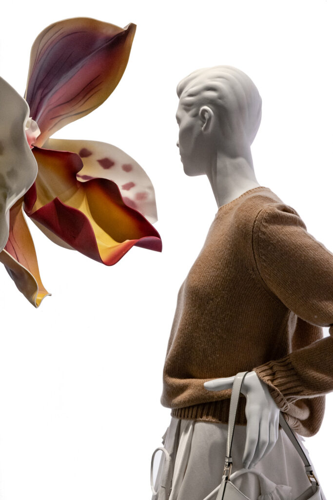
2024/09 Alexander McQueen – FW24


Details:

Alexander McQueen

Fall-Winter 2024

Via della Spiga 4, Milan


Review:

by Peter Hamer
september 01, 2024

It’s been a couple of months since my last visual merchandising tour around Milan. You might be wondering why. Well, there’s been a noticeable slowdown in how frequently stores refresh their displays. Many shops seem to be sticking with the same setups for months, swapping out only the products. From a sustainability perspective, this makes sense, and it’s encouraging to think we might be rethinking our visual merchandising (VM) strategies to be more sustainable. But, if I’m being honest, this slowdown feels more like a cost-cutting measure than a true strategic pivot. If the displays aren’t actively driving sales, how do we measure their success? When a strategy feels uncertain, every decision starts to look like an expense, and unfortunately, visual displays are often the first thing to be scaled back. Believe me, I’ve been in places where even the free coffee disappeared before the displays did! But let’s move on from my reasons for not taking more photos lately.

On my latest VM walk down Via della Spiga, I reached the corner with Via Sant’Andrea and thought, “Ah, McQueen! It’s been a while.” I’ve always classified McQueen’s visual merchandising approach as “Retail Design”—a strategy that leverages the store’s architecture and design, rather than frequently updating the window props. If you know my taxonomy of displays, you know this means the physical store environment remains constant, and only the products change. So, there I was, taking photos of the first window, and I spotted a dress with an asymmetrical neckline—something I hadn’t seen here before at McQueen. I took the photo, moved on to the next window—another women’s display—and then the third. And there it was: a raw edge on a tartan shirt. It took me a moment, but then I realized… this is different! That’s when it hit me: I was looking at the debut collection from McQueen’s new creative director: Seán McGirr. I must admit, I love seeing debut collections in-store because they provide a real litmus test—do they have a clear vision, or are they still finding their way?

Now, let’s discuss the display strategy itself. Essentially, it feels like a continuation of what’s been done before—the same colors, materials, and textures. The products, while slightly different and perhaps more modern, are presented in a way that feels familiar. With minimal props and just the products on display, the question becomes: how relevant is this approach? If you’re familiar with my reviews, you know that when I talk about “relevance,” I’m asking whether a brand’s visual presentation truly reflects its current direction and intent. And in this case, I’m left wondering: does the display communicate the fresh perspective of the new collection? Would passers-by even realize they’re seeing something new if they don’t stop and study the details? Keeping a consistent display strategy can make sense when your product line remains stable and you’re speaking to an established customer base. But when you introduce a new collection and keep the display unchanged, it risks sending mixed signals—are you speaking to your loyal customers or trying to engage a new audience? Clarity is key.

I’ll be honest—if I weren’t so dedicated to capturing these moments, I might have walked right past this display. Besides the new products themselves, there wasn’t much to draw me in or spark a new conversation. What’s changed? It wasn’t immediately obvious. Who is this for? The message didn’t quite come through. The overall communication strategy feels somewhat reminiscent of a more subdued version of Lee’s Burberry—minus the iconic check.

So, it leaves me pondering: McQueen, what’s the plan here? With a new creative director at the helm, there’s a prime opportunity to redefine and refresh the brand’s visual storytelling. It’s a chance to be bold and clear in your messaging. The question is, will you seize it?